

Choosing the right interior design color palettes is one of the most important decisions in creating a space that feels balanced, functional, and visually refined. Color influences how people perceive the size of a room, how comfortable it feels, and how architectural details, furniture, materials, and lighting work together.
However, successful interior design is not simply about selecting attractive wall colors. A professional approach considers the entire environment, from spatial planning and furniture layouts to materials, textures, lighting, and finishes.
For homeowners, developers, and businesses planning premium spaces, understanding how colors interact with the architecture can make the difference between an interior that looks visually disconnected and one that feels intentional and cohesive.
In this guide, we explore how to choose interior color palettes, the most popular color schemes, the role of lighting and materials, and how professional interior designers create sophisticated spaces.
What Are Interior Design Color Palettes?
An interior color palette is a carefully selected combination of colors used throughout an interior space. It can include the colors of walls, ceilings, flooring, furniture, textiles, decorative elements, architectural features, and finishes.
Rather than selecting every color independently, professional designers establish a clear color scheme that creates consistency throughout the space.
A typical palette may include:
- A dominant or base color
- A secondary color
- One or more accent colors
- Neutral supporting tones
- Complementary material and finish colors
The objective is to establish color balance and visual harmony while supporting the function and atmosphere of the space.
For example, a luxury living room might use warm beige as its dominant color, natural wood as a secondary tone, and dark bronze or deep green as an accent. The same principles can be adapted for bedrooms, offices, hospitality spaces, retail stores, and other environments.
For a broader introduction to the fundamentals of planning an interior, see TRIO’s Interior Design Basics guide.
Why Interior Design Color Palettes Matter
Color affects much more than appearance. It contributes to how an environment feels and how effectively people interact with it.
A well-planned palette can:
- Create a distinctive visual identity
- Improve the perceived balance of a room
- Complement architectural features
- Influence spatial perception
- Support the intended mood
- Coordinate furniture and materials
- Create consistency between different rooms
- Enhance the perception of a premium property
For larger projects, the color palette should be established as part of the wider design concept, rather than being treated as a final decorative decision.
This is particularly important when interior design is integrated with construction and architectural planning. TRIO, for example, approaches interiors through spatial planning, material selection, and aesthetic coordination as part of its wider integrated design and construction model.
Understanding Color Theory in Interior Design
The Color Wheel
Understanding basic interior design color theory can make the process of selecting colors much easier.
Colors can generally be divided into:
- Primary colors
- Secondary colors
- Tertiary colors
- Warm colors
- Cool colors
- Neutral colors
Designers use relationships between these colors to create different visual effects.
For example, similar shades can create a calm and cohesive environment, while contrasting colors can introduce energy and visual interest.
Monochromatic Interior Design
Monochromatic interior design uses different shades, tones, or intensities of a single color.
A monochromatic palette does not necessarily mean that every element is exactly the same color. Instead, designers can combine lighter and darker variations while introducing different textures and materials.
For example, a sophisticated neutral interior could combine:
- Cream walls
- Beige furniture
- Taupe textiles
- Light oak flooring
- Darker brown decorative elements
The result can feel cohesive without becoming visually flat.
Complementary Colors in Interior Design
Complementary colors in interior design are positioned opposite each other on the color wheel.
Used carefully, complementary colors can create strong color contrast and make certain architectural or decorative elements stand out.
However, using too much contrast can overwhelm a space. In sophisticated interiors, bold complementary colors are often introduced through carefully selected furniture, artwork, accessories, or accent walls rather than being used across every surface.
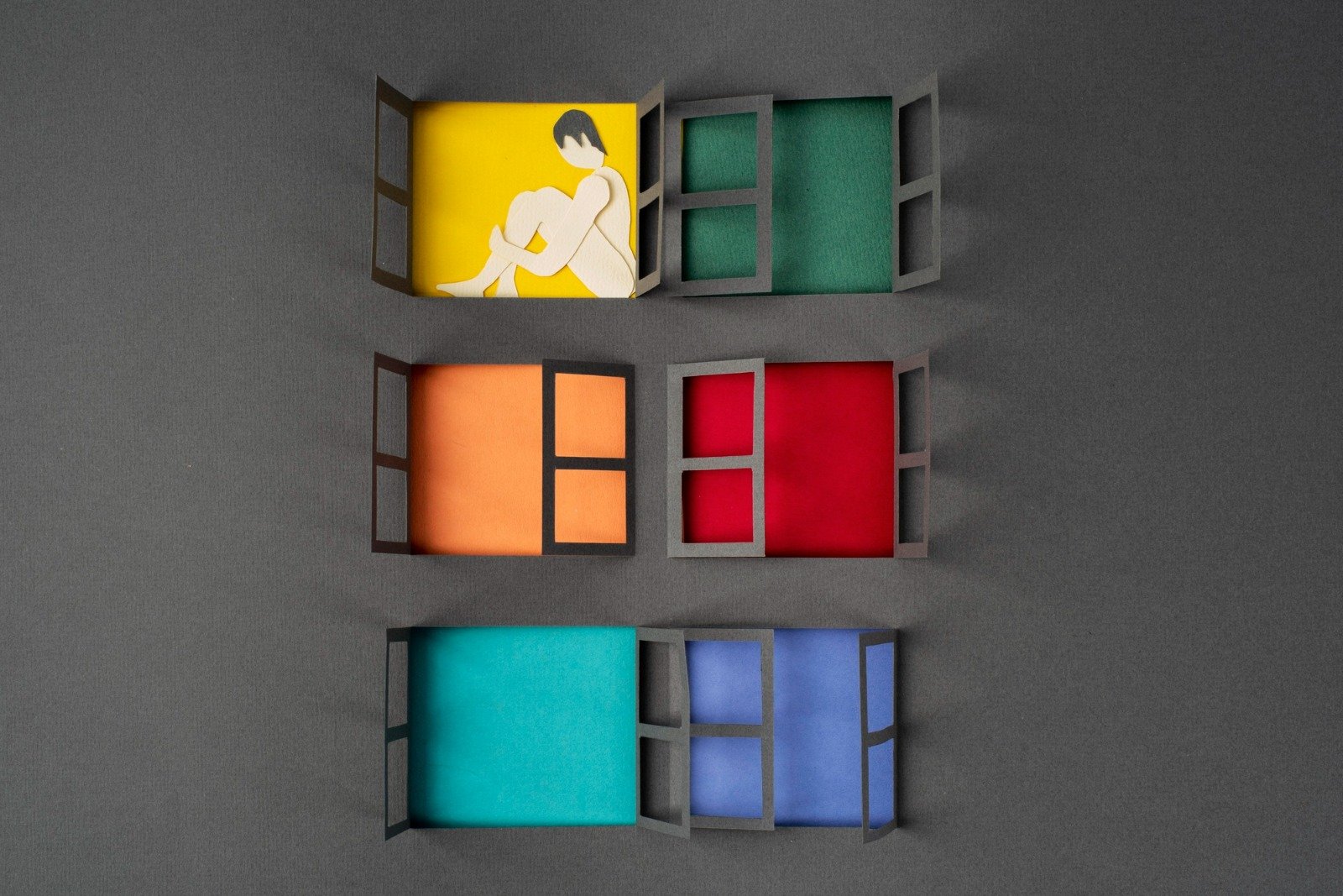
Popular Interior Design Color Palettes
There is no single best palette for every property. The right combination depends on the architecture, function, lighting, materials, and desired atmosphere.
Neutral Interior Color Palettes
Neutral interior color palettes remain popular because they provide flexibility and timelessness.
Common neutral colors include:
- White
- Cream
- Beige
- Taupe
- Grey
- Soft brown
- Off-white
Neutral colors work particularly well with natural materials such as wood, marble, stone, and textured fabrics.
They can also provide a sophisticated foundation for luxury interiors, allowing architectural details and premium materials to become visual focal points.
Warm Interior Color Palettes
Warm interior color palettes can make spaces feel comfortable, inviting, and visually rich.
Common warm tones include:
- Terracotta
- Sand
- Caramel
- Warm beige
- Brown
- Muted orange
- Warm cream
Warm palettes can work especially well in living rooms, hospitality environments, restaurants, and residential spaces where comfort is an important part of the design experience.
Cool Interior Color Palettes
Cool interior color palettes often include blue, green, grey, and related tones.
They can create a sense of calm and visual freshness, particularly when combined with natural light and simple architectural forms.
For example, muted green paired with warm wood can create a balanced contemporary interior, while blue-grey can work well with white, stone, and brushed metal.
Earthy Interior Color Palettes
Earthy tones draw inspiration from natural landscapes and materials.
These palettes may combine:
- Sand
- Beige
- Olive
- Terracotta
- Brown
- Stone grey
- Natural wood
They work particularly well when paired with natural materials, textured fabrics, stone finishes, and warm lighting.
The result is often sophisticated without feeling overly formal.
Bold Accent Color Palettes
Bold colors do not have to dominate an interior.
A neutral foundation can be enhanced with carefully selected accent colors through:
- Lounge chairs
- Artwork
- Cushions
- Rugs
- Curtains
- Decorative objects
- Feature walls
- Custom furniture
This approach allows a space to have personality while maintaining overall color balance.
How to Choose the Right Interior Design Color Palette
1. Consider the Function of the Space
The first consideration should be how the space will be used.
A residential bedroom may benefit from calm, relaxing tones, while a restaurant, retail store, or office may require a stronger visual identity.
This is why commercial interiors should not necessarily follow the same color principles as residential spaces.
TRIO’s interior services cover a wide range of environments, including luxury villas, apartments, penthouses, offices, commercial spaces, retail stores, restaurants, cafes, and hospitality projects.
2. Consider Natural and Artificial Lighting
Lighting and color are closely connected.
The same paint or material can appear significantly different depending on:
- Natural daylight
- Warm artificial lighting
- Cool artificial lighting
- The direction of windows
- The size of the room
- Reflective surfaces
For this reason, colors should be evaluated under the actual lighting conditions of the space whenever possible.
3. Consider the Size and Layout
Color can influence spatial perception.
Lighter tones can help a space feel visually open, while darker colors can create depth and intimacy.
However, color should never be selected based solely on room size. Ceiling height, window placement, furniture proportions, lighting, and architectural details also influence the final result.
This is where spatial planning becomes essential.
Professional interior design considers circulation, furniture dimensions, room proportions, storage, natural light, and functionality before finalizing the visual palette.
4. Consider Existing Materials
A common mistake is selecting wall colors before considering the rest of the interior.
The palette should coordinate with:
- Flooring
- Furniture
- Wood tones
- Stone finishes
- Metal finishes
- Curtains
- Carpets
- Decorative elements
For example, a warm marble floor may work better with warm neutrals than with a very cool grey palette.
The objective is to create a cohesive interior where colors and materials support one another.
How Materials and Textures Influence Color
Color never exists in isolation.
A matte wall, polished marble surface, natural wood panel, velvet sofa, and brushed metal feature can all reflect and absorb light differently.
This means textures and materials can change how a color is perceived.
For example:
- Natural wood can add warmth to neutral colors.
- Stone can introduce subtle variation.
- Textured fabrics can soften strong tones.
- Glossy finishes can reflect light and intensify visual contrast.
- Matte finishes can create a more understated appearance.
This is why professional designers combine premium materials, textures, lighting, and colors as part of a unified design concept.
TRIO describes its interior approach around meticulous spatial planning, premium material selection, and sophisticated aesthetic harmony, rather than treating decoration as an isolated process.
Interior Design Color Palettes for Luxury Spaces
Luxury interiors do not necessarily require an abundance of gold, marble, or dark colors.
Modern luxury interior color palettes often focus on proportion, quality, restraint, and material coordination.
A sophisticated palette might combine:
- Warm white
- Cream
- Taupe
- Natural wood
- Soft grey
- Deep green
- Charcoal
- Bronze accents
The key is how these elements are combined.
A luxury space should feel intentional. Furniture, lighting, architectural details, materials, and colors should contribute to one coherent experience.
TRIO’s interiors division focuses on luxury interior design, fit-out, and turnkey solutions, with services spanning villas, apartments, penthouses, hospitality projects, offices, commercial spaces, retail stores, restaurants, cafes, and furniture styling.
Modern Interior Design Color Palettes
Modern interior color palettes often begin with a restrained base and introduce contrast through materials, furniture, lighting, or carefully selected accents.
Common combinations include:
White + Wood + Black
This combination creates a clean contemporary foundation.
Beige + Cream + Natural Wood
This palette creates a softer and warmer modern environment.
Grey + White + Charcoal
This approach can create a more architectural and sophisticated appearance.
Olive Green + Beige + Wood
This combination brings natural character into contemporary interiors.
Taupe + Stone + Bronze
This palette can work particularly well in premium residential and hospitality environments.
The most important consideration is not simply following interior color trends, but ensuring that the chosen palette works with the property’s architecture and intended use.
For more guidance on selecting an overall style before choosing a palette, TRIO’s Interior Design Styles guide explores modern, classic, minimalist, and other approaches.
Color Palettes for Residential and Commercial Interiors
Residential Interiors
In residential projects, color should reflect the lifestyle and preferences of the occupants while supporting comfort and functionality.
A residential palette can be developed across:
- Living rooms
- Bedrooms
- Dining spaces
- Kitchens
- Bathrooms
- Hallways
- Private areas
Using a consistent base palette across the home can create visual continuity while allowing individual rooms to have their own character.
Commercial Interiors
For commercial interiors, color can also support a company’s visual identity.
Offices, retail stores, restaurants, and hospitality environments may need to communicate a particular brand personality.
The palette should therefore work alongside:
- Branding
- Architecture
- Furniture
- Lighting
- Customer experience
- Operational requirements
The goal is to create an environment that is visually appealing while remaining practical and functional.
Common Mistakes When Choosing Interior Colors
Using Too Many Colors
A large number of unrelated colors can make an interior feel visually chaotic.
Ignoring Lighting
A color that looks attractive in a showroom may appear completely different under the lighting conditions of the actual property.
Choosing Colors Before Materials
Paint should not always be the first decision. Flooring, stone, wood, furniture, and other finishes can strongly influence the final palette.
Overusing Accent Colors
Accent colors are most effective when they have a clear purpose. Using bold colors everywhere can reduce their visual impact.
Following Trends Without Considering Longevity
Interior color trends can be useful for inspiration, but a successful interior should remain functional and visually relevant beyond a single trend cycle.
Ignoring the Architecture
A palette should complement the property’s architecture rather than fight against it.
How Professional Interior Designers Build a Color Palette
Step 1: Define the Design Concept
The designer first establishes the intended atmosphere, function, and overall design style.
Step 2: Study the Space
The team evaluates architecture, proportions, natural light, circulation, and existing finishes.
Step 3: Select the Base Colors
Neutral or foundational tones establish the visual foundation.
Step 4: Introduce Secondary Colors
Secondary tones add depth and create relationships between different areas.
Step 5: Add Accent Colors
Accent colors are introduced selectively to create personality and visual focus.
Step 6: Coordinate Materials and Textures
The palette is tested against flooring, furniture, fabrics, wood, stone, metals, and other finishes.
Step 7: Evaluate the Complete Interior
The final combination is reviewed as a complete environment rather than as individual colors.
This process helps create balanced spaces, sophisticated interiors, and personalized design solutions that connect aesthetics with functionality.
Why Spatial Planning Is Essential to Good Interior Design
Color alone cannot solve a poorly planned interior.
Effective spatial planning determines:
- How people move through the space
- Where furniture is positioned
- How rooms connect
- How natural light enters
- Where storage is located
- How different functional areas interact
- How the available space is used
This is particularly important in large residential, commercial, hospitality, and mixed-use projects.
At TRIO, interior design is integrated with construction and development rather than being treated as a completely separate stage. The company describes its approach as “Building. Designing. Developing. From Concept to Completion,” connecting interiors, construction, and development within one integrated model.
Creating Bespoke Interiors With TRIO
Choosing an interior design color palette is only one part of creating a successful interior.
TRIO approaches interiors as bespoke experiences, combining meticulous spatial planning, premium material selection, and sophisticated aesthetics to create functional and immersive environments.
Its interior services include luxury villas, residential apartments, penthouses, hospitality projects, offices, commercial spaces, retail stores, restaurants and cafes, as well as furniture and styling.
This integrated approach can be particularly valuable when a project requires coordination between design and execution. TRIO also provides construction, project management, engineering consultancy, BIM, facility management, and development services as part of its broader capabilities.
You can also explore TRIO’s portfolio of projects to see examples across residential development, construction, hospitality, architecture, and interiors.
Final Thoughts on Interior Design Color Palettes
The best interior design color palettes are not simply collections of attractive colors. They are carefully developed systems that connect color, lighting, materials, textures, furniture, architecture, and function.
Whether you prefer neutral interiors, earthy tones, bold accents, or contemporary combinations, the palette should support the overall character and purpose of the space.
For premium residential and commercial projects, professional interior design can bring these elements together through thoughtful spatial planning, carefully selected materials, functional layouts, and refined aesthetics.
Ultimately, the goal is to create an interior that does more than look beautiful. It should feel cohesive, function effectively, and provide an experience that remains relevant over time.
If you are planning a residential, commercial, hospitality, or luxury interior project, TRIO combines interior design, construction, and development capabilities to take projects from concept through execution.
Follow us: